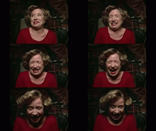
I am prone to hyperbole. What can I say? It makes me giggle. So if you want to accuse me of exaggerating, well, guilty as charged.
But this? This made me go full 2009 Kanye. Imma let you finish, but this is the greatest marketing image of all time. Of all time!
Below is live footage of me first seeing said image.

All laughter aside, it is interesting to analyze this piece. There’s roughly 687% more text than your standard ad these days (despite the fact that longer content pieces get shared more, which is a trip), and the copy is…uh…let’s go with “suggestive.”
Really suggestive.
Over all, it doesn’t hold up. Not just because standards have changed. There’s the wall of text, too, and the fact that our dude here is presented like he’s a contrapposto snack in a way men often aren’t. Add in the TAB Cola-esque sans-serif font and this feels like a time capsule from an era that would make Austin Powers feel a little gross.
So what do we learn from this?
- Stephen King has really changed his aesthetic.
- Obviously, the 70s were weird.
- Also obviously, stuff can get dated.
- You get to decide if you’re writing for the now or writing for always.
- Both have their place.
So here it is, y’all. You’re welcome. Feast your eyes.
Then maybe go outside and get some fresh air.

Ohhhh comes in short sleeved too 😉
Wonderful! I’ll take a dozen.